
History of Telepathy
The original Telepathy game was first created in 2008 by Derek Chinn in Seattle, Washington. After receiving a board game for Christmas the prior year and being unimpressed, thinking, “I can do better than this,” Derek set about to create his own game. After countless hours of hard work, prototyping and play testing, Telepathy was released later that year, quickly becoming a favorite within the game-playing community along with specialty retail toy and game stores.
2018 & Time for a Refresh
We set out to update Telepathy with the goal of improving the look and feel while maintaining and hopefully improving the award winning play of the original.

A Refreshed Look for the Game Box
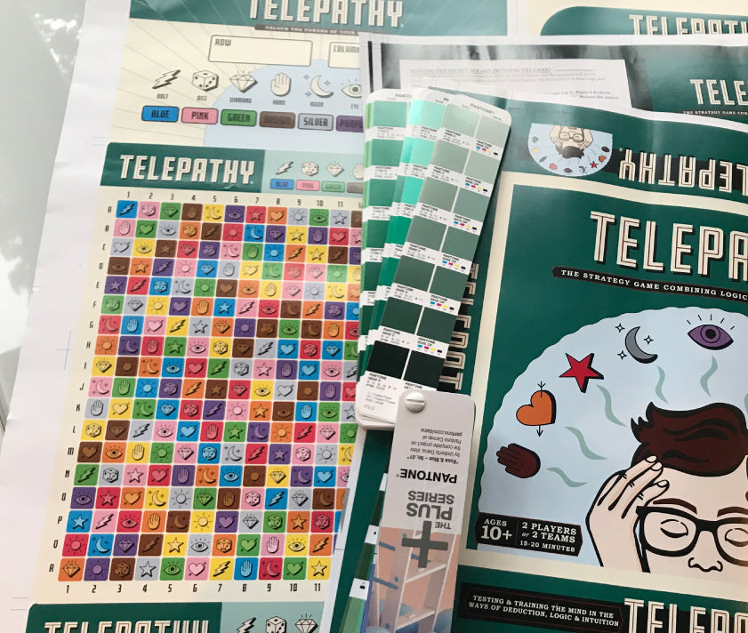
Starting with the box, the red and black colors were updated to a modern dark spruce green, pale blue and parchment color. Since Telepathy originated in Seattle, we thought it would be appropriate to give the illustrated player some hipster hair and glasses. The box exterior now is printed in a smooth modern matte finish instead of high gloss and the typeface, Fresno Black Inline, was chosen as a nice update to the original logotype.

Game Board
The challenge with the game board was how to improve and update the design and keep the board easy to read and play. With 9 symbols, and 9 colors on what is essentially a grid board, this was a good challenge.

Updating the Symbols
All of the symbols were given more personality with rounded details and a new symbol was introduced: the dice. Again, the challenge was how to give the symbols more visual interest without distracting from the play. A drop shadow was used for a little additional depth and visual interest. The center of each of the new symbols has a slight color shift from the main square color which adds some pop, while at the same time keeping the emphasis on that square’s individual color. (After all, the purple square must be purple!)
Updating the Game Board Grid
The original Telepathy board was a strict grid with black lines dividing the squares. We removed the black lines, and instead used the parchment color to divide the squares. Each square now has rounded the corners to soften the board a bit. The overall effect is the board squares are nestling gently within the off white background giving it a grounded and soothing look.

Colors
We took a long look at the colors. The challenge was how to update the colors to make them more pleasing and modern while still keeping enough contrast for all 9 colors to be easily played within the game. Feeling that the white square on the original board created too much contrast and stood out, we replaced it with brown. We then shifted the color hues slightly to be a more complementary palette of colors. The goal was to make each color brighter and richer.
Board Shape and Feel
The new Telepathy board is slightly taller than the original. At the top of the board we have included an area showing the symbols and colors that can be marked during game play. This is a great visual reminder showing the colors and symbols that you are trying to hone in on.

Score Keeping
The original Telepathy was scored by either marking the board, or marking on a separate card that stands next to the board. This card is where you also write your pick that your opponent is trying to guess. A privacy shield has now been incorporated that was first introduced with Brain Freeze (the younger kids version of Telepathy). The privacy shield is a freestanding piece that stands in front of the game board facing your opponent. The back side where you can both score during the game and keep your pick is shielded from your opponent. The positioning of this privacy shield at the top of the game board intensifies the back-and-forth, head-to-head action of Telepathy.

To another 10 years.
As reality becomes artificial and the robots are born; here’s to another ten years of simple pleasures; gathering with family and friends to play your favorite board game.